Keeping a consistent look for your brand is a very important piece in building brand loyalty and recognition. For those of us that work in marketing, this is an obvious statement that drives a hundred percent of our style and branding decisions. If you run a company and don't have a style guide for your business, you probably need to hire a marketing agency that specializes in branding to get help to organize your image.
In this article, I explore how Wapiti builds our business and our client's businesses with a marketing style guide as the foundation.
There are many different things you can do to ensure that you're on brand and everything within it has your business personality clearly presented. This is most notable in your company style guide. And for reference, a style guide is just that: a guide to the style of your company.
THE BASICS
Let's just say you're starting off your company for the first time. (Now, if you have an established company, great! This is still super important to go through.) The following are four basic practices to go through in no particular order when developing your style guide.
LOGO

First, your logo. You have established your brand name. (Reference a previous article here on how to choose a company name by picking the right domain name.) Now, it's time to build your logo. There is a ton of variety and preference for company logo's out there.
Let's consider an example from one of the bigger companies out there; Starbucks. Think back to the first edition of their logo - it was very detailed. Their marketing team recognized some immediate and pressing changes such as adding clothes to the mermaid, which they did quickly rectify. The mermaid has been updated over the years, streamlined, and designed to be more simplistic. It's still a graphic heavy logo in comparison to brands like Nike. Watching the evolution of the Starbucks brand, moving from detailed to simplistic and the success of the iconic Nike brand, we understand the best logos are going to be simplistic. They are going to clearly present who you are and what you do as a company.
Currently, we've seen a trend of businesses moving away from graphics in their logo, instead of using their company name for their branding. Wapiti is a great example of using both graphic and name in styling a logo. Our name is the predominant part of our logo with a "shouter" man in the middle.
COLORS

Colors are important as they reflect who and where you are. There is even a whole psychological process when it comes to choosing colors. For example, typical colors for a restaurant are yellow, red, and blue, which is why you see a lot of fast food chains like McDonald's using this style guide. Jack in the Box uses red, while Burger King employs a lot of yellow. These colors psychologically make you hungry. While you might not buy into the psychological process of branding colors, big businesses are paying attention to it because it gives them an edge in their market.
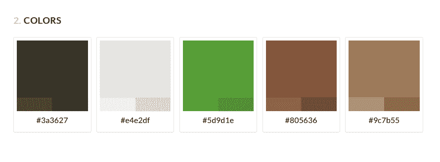
One standard piece of advice is to use the color green, (unless you are a business that predominately works with the earth. Branch Shouter predominately works with computers; we use green in our color scheme as it speaks to our target audience. It conveys where we are here in the Pacific Northwest.
FONTS

Next: fonts. You don't want to have a brochure go out for your business that is typed up in Times New Roman while your website is styled in Google's popular Sans font. Then have custom embroidery with an in-between look. This is incongruent. You want your marketing to have a unified look. This happens by establishing your branding fonts.
Current trends show a lot of businesses using Google fonts to find good, standard fonts. But, there is a drawback to this trend. The problem with Google fonts is they are universally used leading to overuse. Remember the days of Papyrus font? It had a brush stroke look to it. Everyone jumped on trend to use Papyrus in their marketing. It went from being unique and creative to overused and boring. The movie Avatar was released shortly after the Papyrus craze using the font in its styled title. This seemed like a huge oversight for such a big budget film. That said, overused fonts are ones you want to avoid. You can do this by purchasing fonts, which are not especially expensive but give your branding a unique, well-designed style. (Reference a previous article here on finding the right font for your company brand.)
OVERALL LOOK AND FEEL
Last, and what brings all other components together is the overall look and feel of your branding. Depending on your business, target audience and personality, you will want to define a look that you appreciate. Wapiti values a clean, crisp look, which permeates our office style. Our office design incorporates a lot of white, including a white desk. White minimalist is heavily trending in marketing right now resulting in our style guide targeting our audience effectively.

Once you have all of these components clarified and you've defined an overall look and feel - crisp site, photo/graphic heavy, bold fonts, etc., - you consider the longevity of your style guide and commit to your branding as the pillar of your business. That is until you decide to evolve your brand in the future, like in the case of Starbucks.
All of these components come together to form your overall style guide. This is a comprehensive, congruent branding guide for your company. We're a marketing company, and as such, we create style guides for our clients when they hire us to consult with them on creating or revamping their marketing strategy. One of the first things we do is help them attack those four points that we just mentioned.
CREATING A STYLE GUIDE
We do this in the creation of their company style guide. This is a comprehensive marketing approach to color, font, logo, and overall look and feel. It includes web style and print style. For example, if as a business you hire someone to make a brochure for you, you will get that person's personality in the brochure. Sometimes, that's a good thing, but more often than not, it is off from your marketing style guide and far from what you want your business to reflect. However, if you give that designer a comprehensive style guide, you will get a design that is congruent with your overall company branding and also incorporates the designer's personality and interaction with your marketing strategy.
Now, when you are a small business, this is important because you often don't have full-time graphic design staff. It's possible that you won't have the same graphic designer from project to project. The marketing style guide is an important piece for you to ensure that your marketing team is incorporating their design work with your design style. This results in your design always looking accurate.
A style guide is the overall look of your business. It's referred to as the design cheat sheet for your brand. When we build a marketing piece for our company, the first thing we do is open up our style guide. Whether it is an advertisement for Facebook, Google, Twitter or print marketing, the look is completely on style. Our style guide spurs on our creatively as it frees up time and focus from initial brand creation to promotion and marketing materials.
WHO NEEDS A STYLE GUIDE?
Here's the thing, if you don't have a style guide, you need one, and if you have one that is outdated or incongruent with your brand across your marketing strategy, you need to update your design and reformat your style guide. Start now. Even a one-man business needs a style guide: logo, business cards, invoices, brochures, etc. The reality is your business branding needs to look the same because it gives potential clients the confidence that you're at least with it enough to ensure that your design matches. Consider your personal response to a business that employs a marketing strategy with no rhyme or reason? When you have a similar look people are going to instantly respect you and you're going to gain trust with that.
Start now and start from the beginning. Consider the four basics listed above in building your brand: designing your logo, choosing your fonts choosing your colors, and establishing your overall look and feel. Once you've slowly transitioned into your style guide, make it your Bible. There's room for creativity. There's room for wiggling. But all of that is room within the framework that your style guide creates.
CONCLUSION
In conclusion, it is important that you have a style guide for your business, even if you do all the work yourself. However, when you start bringing in team members to help you, your style guide becomes imperative. This will ensure that the work that gets done matches your brand and is part of a complete marketing strategy.


