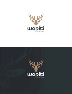
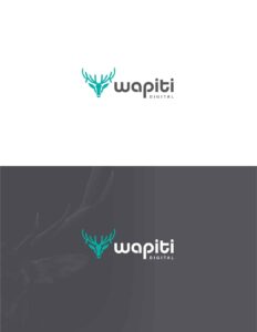
Wapiti has just endured a radical rebranding from our original name, Brand Shouter. While we'll continue to serve our clients in exactly the same way, we are changing everything about our brand from the ground up similarly to starting a new business.
For this article, we explore the process Wapiti took in selecting our new logo. For any business, your logo is one of the most important parts of your business. It is how clients and prospects alike grow to recognize your brand.
The Design Story
I call this process the "design story". This is a step-by-step to take you through how we finally arrived at our perfect logo. Our design story was a bit odd as the logo process proved to me that I wanted to change the name as well. Often, the name is decided on prior to the logo process.
Either case, I hope you enjoy my design story and learn from it for your own business.
Phase 1: Inspired Doodles
To start the logo design process, our lead graphic designer had a "doodle session" where he brainstormed ideas to match our name. Now at this phase, we didn't realize that our name would be changing For us, the logo design process is what brought us to the realization that our name needed to change.
These were fun but weren't really hitting the mark in my mind. Initially, I was more convinced about the eagle and the lion.
I also realized the most important point that changed everything: I wasn't in love with my brand name. Not only that, I wanted to completely change it altogether. The last sketch, above, is where I asked him to hold off while I came up with the new name, Wapiti. The name was almost entirely off the last image - the wapiti head.
Step 2: Digital 1st Drafts
During the doodle process, my graphic designer did send me a few digitized versions. It's hard to fit this into the timeline so I'm going to skip them for the purpose of this narrative. What was important was that I had chosen a name and the general image I wanted - a wapiti.
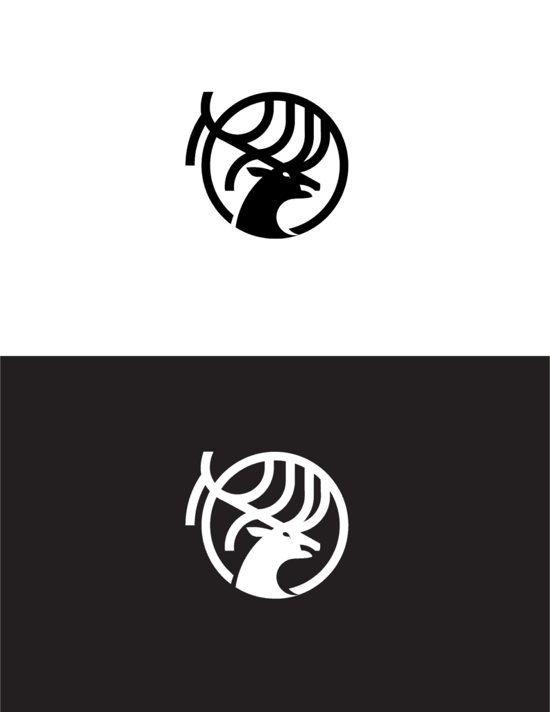
The image above is the first digital version of the wapiti head logo that I saw. I really liked it as a start but something wasn't hitting me right. He took my critiques and went back to the drawing board.
The next batch of images was definitely hitting the mark. I had a hard time choosing between a couple of them, to be honest. He also showed me a few font options with this group to help me pair a logo and font. Ultimately, I really liked the first logo above and the last one. Something about the last one stood out but it felt too weak for my taste - so I had him take another stab at it...
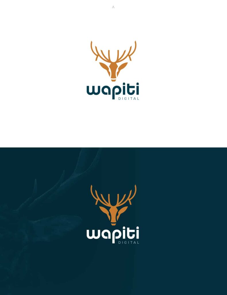
It was perfect! I loved the wapiti head and the font. We did make the word "digital" slightly thicker to stand out more but this was the logo. My focus group confirmed that they loved it too.
Choosing Colors
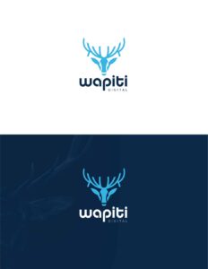
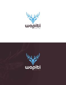
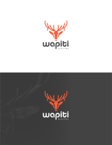
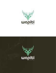
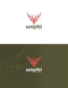
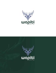
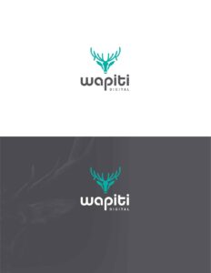
Choosing colors went hand-in-hand with my logo selection. Once I had settled on the logo I wanted, we then went into color selection. I left most of the heavy lifting in my graphic designer's court. He did a great job of getting back to me with a lot of options...
Like I mentioned above - I was sent a lot of options. 3 or 4 of these were great and my focus group really like them. The biggest issue was that each of us had different favorites and it was hard to decide. At this point, I was ready to just choose my favorite and move forward but I decided to take a couple of days and come back to these all.
After taking some time, I realized something that didn't occur to me before. The originally chosen color scheme was my favorite. Also, my entire focus group had the original color scheme in their top two or three favorites as well.
With that, I selected to original and we now have Wapiti's new logo!
