NonProfit
Leveraging conversion tactics to boost donations.
Self Help International
Waverly, IA
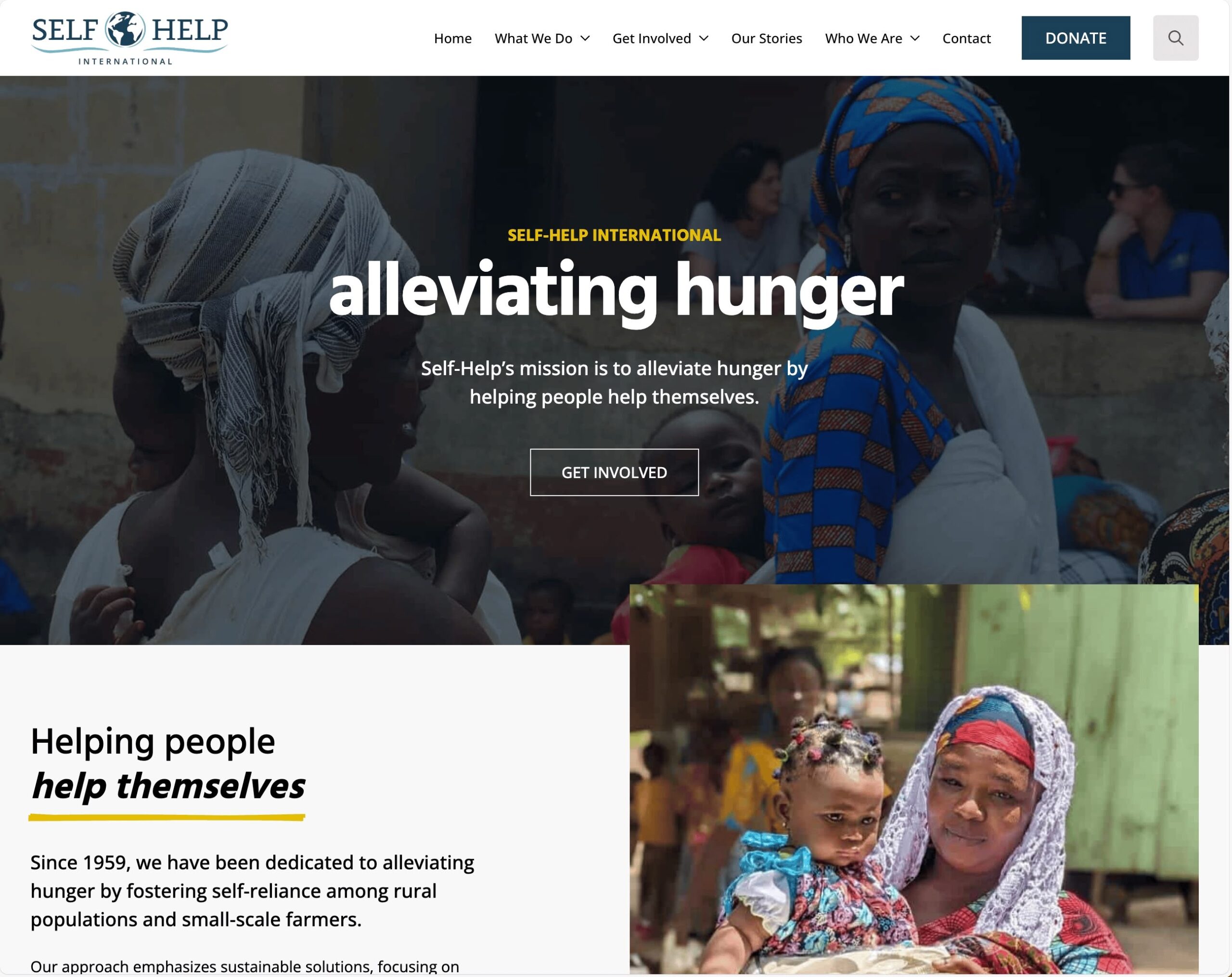
When we took on selfhelpinternational.org for Self-Help International, we were stepping into a mess—an outdated, broken website that was more of a stumbling block than a storyteller for this nonprofit’s incredible mission. The challenge was to tear it down and build something new, something that didn’t just function but sang the organization’s song. They’re all about empowering communities in places like Ghana and Nicaragua through sustainable solutions—clean water, better farming, education—and they deserved a site that could carry that weight, connect with donors, and inspire action. It was a tall order, but we were ready to roll up our sleeves.
What we delivered was a fully custom nonprofit website that’s as vibrant and purposeful as the people it serves. We ditched the old clunkiness for a design that’s warm and inviting, weaving their story through every corner—photos of smiling farmers, stats on lives changed, and a clear call to get involved. It’s not just pretty; it’s practical, with easy navigation for donations, program details, and updates on their work. We worked closely with the Self-Help team, tweaking and tuning until it felt just right, and when we hit launch, their reaction said it all—they were over the moon. It’s a site that doesn’t just tell their story; it pulls you in and makes you want to be part of it.
The client’s joy is palpable—they’re absolutely delighted with how it turned out, and for good reason. Where their old site was a battleground of glitches and frustrations, this new one hands them the reins. They can tweak content, post updates, and share their latest wins without wrestling with a system that fought them at every turn. It’s a night-and-day shift, giving them the freedom to keep their story alive and evolving, and that empowerment is already lighting up their day-to-day. For Self-Help International, this isn’t just a website—it’s a tool they can wield with pride, and we’re thrilled to see them run with it.
Visit selfhelpinternational.org
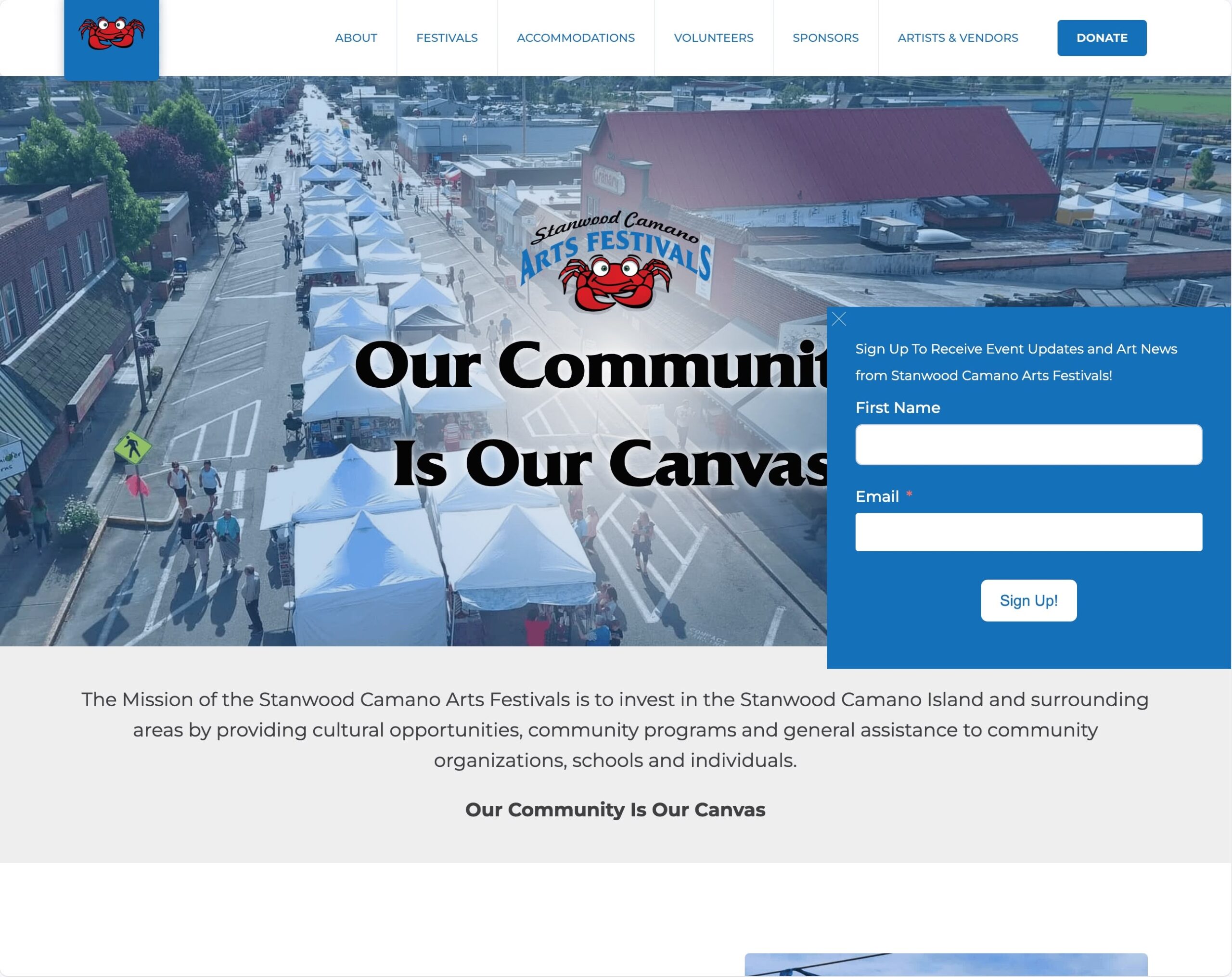
Stanwood Camano Arts Festivals
Stanwood, WA
When we got our hands on artsfestivals.org for Stanwood Camano Arts Festivals, we were staring down a relic—an outdated, broken website that did a terrible job of showing off their vibrant festivals and the incredible artists behind them. The challenge was to rebuild it from the ground up into something that didn’t just work but dazzled—a fully custom site that could spotlight their events, feature the participating creators, and make it all easy to digest. They needed a digital stage that matched the energy of their real-world gatherings, one that could draw in visitors, artists, and vendors alike, and we were itching to make it happen.
What we came up with feels like a breath of fresh air. The new site is clean and sharp, with big, bold visuals that drop you right into the heart of their festivals—think bustling crowds, colorful booths, and artwork that pops off the screen. We carved out space to celebrate the artists, giving each one a little spotlight with their work and story, so you can feel the talent behind the scenes. But it’s not just eye candy—we made it useful. There’s a seamless sign-up process for artists and vendors, and all the visitor info (dates, locations, schedules) is laid out so clearly you can’t miss it. We even tucked in a donation button that’s hard to ignore, turning goodwill into action with a single click.
The difference is striking. Where the old site was a ghost town—unusable and ignored—this one’s buzzing. It’s become a go-to spot, pulling in traffic because it actually delivers what people need: a window into the festivals and a way to get involved. Donations are rolling in too, thanks to that prominent button catching eyes and hearts. For the organization, it’s a total turnaround—they’ve got a site that’s not just functional but alive, supporting their mission and amplifying their reach in ways the old clunker never could. It’s proof that when you get it right, people show up.
Visit artsfestivals.org
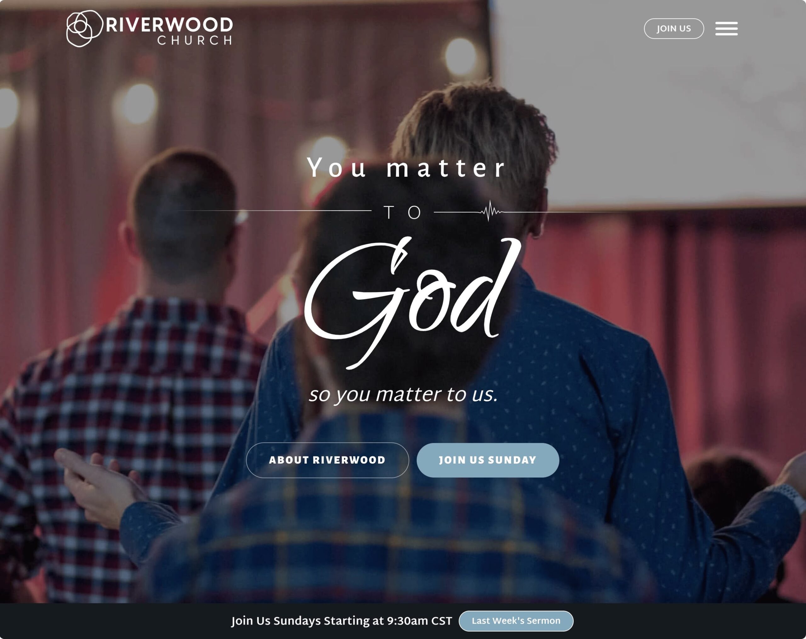
Riverwood Church
Waverly, IA
When we stepped into the project for weareriverwood.org, Riverwood Church had a website that had been a faithful servant for years but was showing its age—cracking at the seams, looking dated, and struggling to keep up with their growing needs. The challenge was multifaceted: give it a visual and functional overhaul, swap out a clunky podcasting setup for something visitor-friendly, and take their sermon content to the next level by editing videos, pulling audio for podcasts, and transcribing then summarizing them for the blog. It was a big lift, but we saw it as a chance to breathe new life into a community hub that deserved to shine.
What we delivered was more than just an update—it’s a stunning, fully dynamic website that feels like a dream come true for a nonprofit like this. The design is gorgeous and modern, pulling you in with a warmth that mirrors the church’s spirit. We tackled every piece of the puzzle: sermon videos are now polished, with audio seamlessly exported to a slick new podcast platform that’s a breeze for visitors to use. Those same sermons get transcribed and distilled into blog summaries, making the teachings accessible in whatever format suits you best. Beyond that, we wove in email marketing tools to keep the congregation connected, added a giving feature that’s smooth and secure, and introduced “connection cards”—a digital way for visitors to say “I was here,” ask for prayer, or just reach out. It’s a site that doesn’t just sit there; it works hard for the church and its people.
The impact has been a joy to watch. Site usage has shot through the roof—exponential growth that shows how much the community was craving this upgrade. The pastor, staff, and elders couldn’t be happier; they’ve got a tool that not only meets their needs but exceeds what they imagined. It’s not just about the flashy new look (though they love that too)—it’s the way it’s brought everything together, from sermons to giving to personal connections, into one vibrant, living space. For Riverwood, this is more than a website; it’s a launchpad for their mission, and seeing it click with everyone involved has made it all worthwhile.
Visit weareriverwood.org