If you sell coffee online, your website has to do two jobs at once. It needs to spark desire, and it needs to make choosing easy.
That balance is harder than it looks. Coffee buyers care about flavor, origin, roast level, brew method, freshness, subscription options, and brand story. A generic retail theme can look polished and still fall short when your customer wants to compare a washed Ethiopian filter roast against a chocolate-forward espresso blend in under a minute.
The strongest coffee eCommerce sites do not rely on aesthetics alone. They use the right theme as a starting point, then pair it with UX patterns that reduce hesitation, build trust, and move people smoothly into checkout.
A coffee store needs more than a good-looking storefront
A coffee brand lives in the details. Your bags may look great in a homepage banner, but shoppers still need quick answers. Is it light or medium roast? Best for espresso or pour over? Whole bean only, or can they choose grind? Can they subscribe? Is this a seasonal release that may sell out soon?
That is why theme selection matters so much for roasters. You are not just choosing fonts, colors, and homepage sections. You are choosing the structure that supports product filtering, variant selection, education, reviews, bundles, and recurring orders.
A strong coffee-focused theme should help you support all of these needs:
- Fast mobile browsing
- Clear collection pages
- Variant-friendly product pages
- Sticky cart or quick add
- Storytelling sections
- Strong search and filtering
- Room for subscriptions and bundles
If your current theme fights those goals, no amount of visual polish will fix the friction.
Strong theme choices by platform
Different platforms make sense for different business models. Shopify is a strong fit if you want a stable hosted setup with solid theme options and a large app ecosystem. WooCommerce makes sense when you want more control over content, subscriptions, or custom flows. BigCommerce can work well for larger catalogs or operations that need strong native commerce features.
Here is a practical view of several well-known options that suit coffee brands.
| Platform | Theme | Best Fit | Standout Strengths | Watch For |
|---|---|---|---|---|
| Shopify | Emporium, Arabica preset | Roasters that want a polished catalog fast | Menu-style product layouts, promo sections, quick buy, sticky cart | May still need app support for subscriptions or advanced bundles |
| Shopify | Select, Espresso preset | Brands using strong visuals and launch campaigns | Hero video, media-rich layouts, filters, countdown features | Needs disciplined content so it does not feel busy |
| Shopify | Whisk | Content-driven coffee brands | Blog and recipe support, recommendations in articles, store locator | Best when you plan to publish often |
| Shopify | Keystone | Roasters with wholesale or higher-volume ordering | Bulk ordering, quantity breaks, bundles, upsells | Higher cost, better value when you need B2B tools |
| Shopify | Filter, Essentials preset | Catalogs with many coffees or attributes | Advanced filtering, clean design, product badges | Requires thoughtful attribute setup to shine |
| WooCommerce | Coffee Shop | Brands wanting strong editorial control | Flexible layouts, block-based editing, responsive design | Needs careful plugin management for speed |
| WooCommerce | Coffeeter | Stores wanting visual builder flexibility | Quick view, AJAX cart, wishlist, category filtering | Builder-heavy setups can become bloated |
| BigCommerce | Cornerstone Warm | Brands wanting a low-cost starting point | Responsive layout, faceted search, quick add, featured products | Often benefits from design customization |
| BigCommerce | CoffeeZone / Tea & Coffee | Coffee and café-style stores | Promo blocks, modern layouts, mobile-friendly design | Customization quality varies by theme vendor |
The theme itself is not the whole answer. The better question is this: does your platform-theme combination support the way you sell coffee?
If you rely on subscriptions, your theme must make recurring purchase options obvious. If you sell single origin drops, your product page needs room for nuanced tasting notes and availability cues. If you sell wholesale and retail, your site has to handle both without confusing either audience.
What separates a coffee-ready theme from a generic one
Many retail themes claim they work for any category. That is technically true. It is rarely the same as being efficient for coffee.
Coffee has repeat purchase behavior, but it also has a learning curve. One customer already knows exactly what they want. Another needs help choosing between roast levels, origins, and brew methods. Your design has to serve both people without slowing either of them down.
The best setups usually prioritize a few key patterns:
- Attribute filtering: Roast level, origin, process, flavor notes, brew method, caffeine status
- Variant clarity: Whole bean or ground, grind type, bag size, frequency
- Quick path to cart: Sticky add-to-cart, collection-level quick buy, slide-out cart
- Storytelling space: Farm notes, roasting philosophy, brew guidance, subscription explanation
- Trust signals: Reviews, freshness information, shipping details, limited-release cues
When those pieces are built into the theme well, your store feels easier to shop. When they are missing, every purchase takes more mental effort.
Product discovery should feel like guided retail
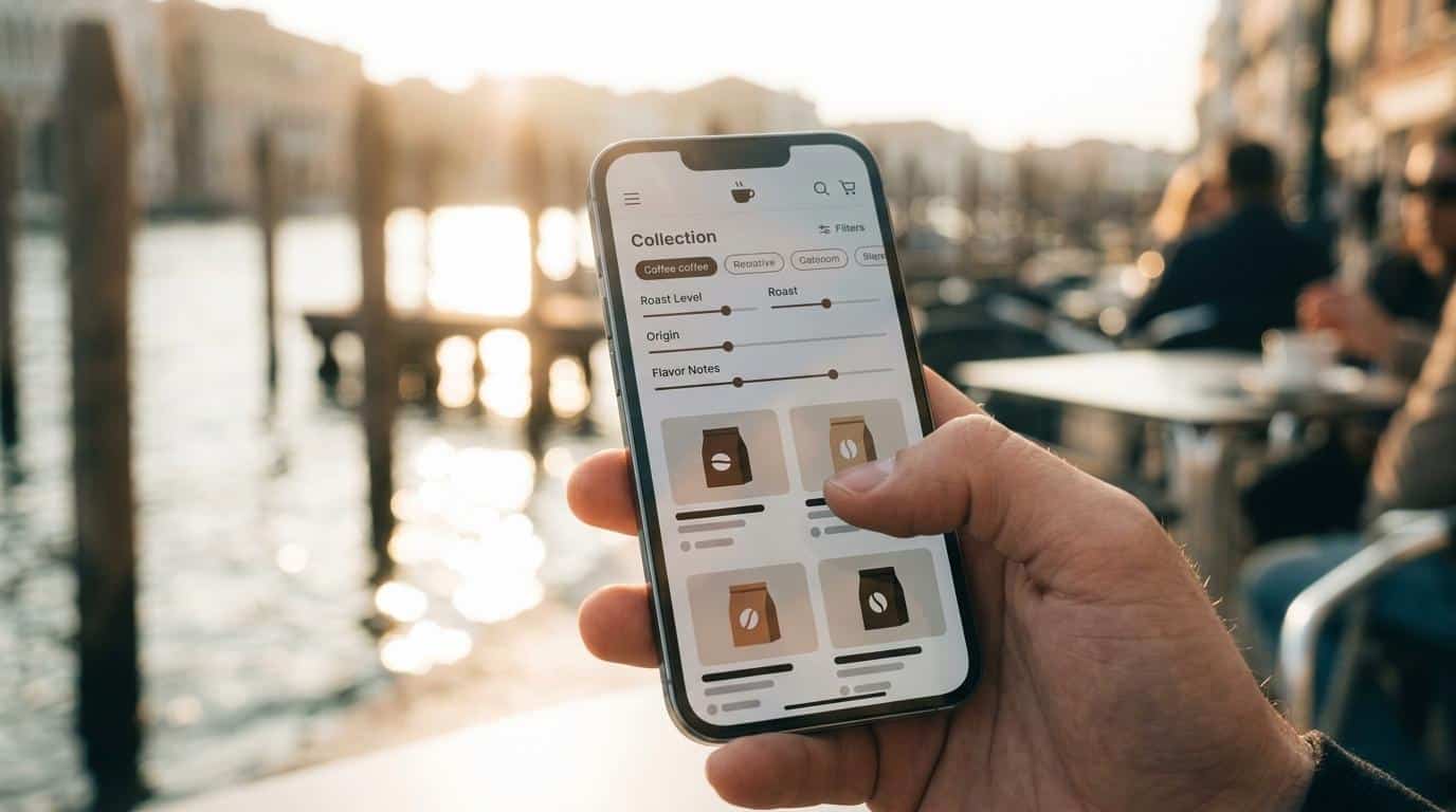
Your customer should not have to translate your catalog structure in their head. If someone wants a bright, fruit-forward coffee for pour over, you should help them reach that answer quickly.
That starts with collection architecture. Clear top-level categories work well: single origin, blends, espresso, decaf, subscriptions, gear, and gifts. Inside those collections, filters should narrow the list in ways that match how people actually shop for coffee.
Roast level is obvious. Origin is essential. Flavor family can be even more persuasive. “Chocolatey and nutty” is often more useful to a newer buyer than “natural process.” Brew method also matters because it turns your store into a guide, not just a shelf.
Search deserves the same attention. If someone types “espresso,” your site should return espresso blends, espresso-friendly single origins, and possibly grinders or related gear. Good site search rescues a lot of intent that menus miss.
A few proven patterns tend to work especially well for roasters:
- Roast level chips on collection pages
- Flavor-note filters
- “Best for” labels for espresso, drip, French press, and pour over
- Featured seasonal or limited-release collections
- Quick compare views for key tasting attributes
This is one of the fastest ways to improve conversion without redesigning everything.
Product pages should answer questions before they are asked
A coffee product page has one main job: remove uncertainty.
That means your product title and hero image are only the start. You also need a clean structure for flavor notes, origin, processing method, roast level, brew recommendations, bag size, and grind options. If you can say all of that in a way that feels scannable, you are doing valuable sales work before a customer ever contacts you.
High-performing coffee product pages usually blend sensory language with practical buying details. You want the page to create appetite, but you also want it to reduce mistakes. A buyer choosing ground coffee for auto-drip should not wonder if they picked the right grind. A subscriber should not wonder when the next order will ship.
Reviews matter here too. Coffee buyers often trust other drinkers to confirm whether a roast really tastes the way it is described. Star ratings on collection pages help with skimming, and written reviews on product pages help close the gap between interest and action.
Video can also be powerful when used with restraint. A short clip of brewed coffee pouring, beans being ground, or a roaster explaining flavor profile can add confidence fast. The key is not volume of media. It is relevance.
Educational content is not separate from selling
Many roasters treat blogs, brew guides, and origin stories like side content. They are not. They are part of your sales system.
Coffee is one of the easiest product categories to support with education because people genuinely want to learn. They want to brew better, understand tasting notes, and feel connected to what they buy. If your theme supports article layouts, product callouts inside content, and strong internal linking, you can turn education into a steady conversion asset.
This matters for search visibility too. A well-written guide on choosing coffee for espresso or dialing in a V60 can attract the right visitors, then send them directly into relevant products or bundles.
Even small content modules can help:
- Brew tips: Short, practical instructions on each product page
- Origin stories: A few well-written paragraphs that give context without slowing the page
- FAQ blocks: Shipping, freshness, grind selection, and subscription details
- Related products: Beans, gear, or sampler packs matched to the article or coffee
When your site teaches clearly, your brand feels more credible and easier to buy from.
Subscription UX should be obvious, honest, and easy to manage
Recurring revenue is a major opportunity for coffee brands, but poor subscription UX can hurt trust fast.
Your site should make the difference between one-time purchase and subscription instantly clear. Frequency, price, shipment timing, and cancellation or skip options should never be buried. When those details are straightforward, subscriptions feel convenient instead of risky.
The purchase flow matters just as much. A strong pattern is a simple toggle on the product page with pricing, delivery cadence, and subscriber perks visible before add-to-cart. That keeps the choice easy. It also reduces the kind of friction that leads to abandoned carts or support requests.
The post-purchase experience matters too. If customers can log in, swap products, pause a shipment, or skip a cycle without frustration, they are far more likely to stay subscribed.
Mobile speed and checkout discipline win sales quietly
A beautiful coffee site that loads slowly on mobile is still a weak store.
Coffee brands often lean heavily on large photography, homepage video, Instagram feeds, location embeds, and animated sections. Used without restraint, those choices can drag performance down. Better practice is simple: compress images, load only what matters first, and replace heavy embeds with lighter alternatives where possible.
Checkout should follow the same discipline. Keep fields to the essentials. Support guest checkout. Show wallet payments if your platform allows them. Make shipping costs clear. Let users edit cart contents without confusion. Keep the process focused.
A few checkout habits are especially useful:
- Guest checkout: Do not force account creation before purchase
- Mobile wallets: Apple Pay, Google Pay, Shop Pay, or similar options
- Progress clarity: Clear steps and visible order summary
- Field restraint: Ask only for what you truly need
- Subscription transparency: Billing frequency and renewal timing shown before payment
These changes are not flashy. They are profitable.
When a custom build makes more sense than another theme hunt
Sometimes you do not need a new theme. You need a better structure.
That is often true when your business combines retail, wholesale, subscriptions, education, gifting, or membership under one roof. A prebuilt theme may cover 70 percent of what you need, then leave your most important revenue paths awkward or hidden.
That is where custom work becomes valuable. You can keep the speed of a proven platform while shaping the store around your real buying flows. For coffee roasters, that may mean custom collection filters, a better subscription selector, wholesale login paths, richer PDP layouts, or landing pages built around gift boxes and coffee clubs.
A thoughtful build should still protect simplicity. The goal is not to add complexity because you can. The goal is to remove friction where your customers actually feel it.
If your coffee brand is growing, that mindset will serve you better than chasing trendier visuals every year. The strongest stores tend to look clear, feel trustworthy, and make buying feel easy from the first tap to the reorder.