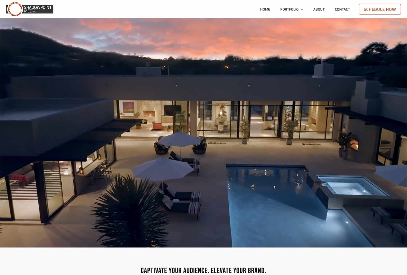
In the realm of website design, website navigation plays a pivotal role in shaping the overall user experience. A well-designed website navigation system can guide visitors effortlessly through your website, helping them find what they need quickly and efficiently. Conversely, poor navigation can lead to frustration and abandonment, ultimately harming your conversion rates. To ensure your website’s navigation enhances user experience, here are some essential do’s and don’ts to keep in mind:
Website Navigation Do’s:
- Keep it Simple and Intuitive: The cardinal rule of navigation design is simplicity. Aim for a clear and intuitive navigation menu that users can easily understand and navigate without confusion. Use familiar terms and organize menu items logically based on your website’s content hierarchy.
- Prioritize Clarity and Consistency: Maintain consistency in navigation elements across all pages of your website. Use the same menu structure, placement, and styling throughout to provide a cohesive experience. Ensure that clickable elements are easily distinguishable and affordance is clear.
- Optimize for Mobile Responsiveness: With the rise of mobile browsing, prioritize mobile responsiveness in your navigation design. Implement hamburger menus or other mobile-friendly navigation patterns to accommodate smaller screens without sacrificing usability.
- Include Search Functionality: Supplement your primary navigation with a search bar prominently displayed on every page. This allows users to quickly search for specific content or products, especially when they have a clear intent in mind.
- Utilize Visual Cues: Incorporate visual cues such as hover effects, active states, or breadcrumbs to provide feedback and guide users as they navigate through your website. Visual cues help users understand their current location within the site’s structure and facilitate seamless exploration.
- Test and Iterate: Regularly conduct usability testing and gather feedback to identify any navigation pain points or areas for improvement. Use analytics data to analyze user behavior and make data-driven decisions to optimize your navigation over time.
Website Navigation Don’ts:
- Avoid Overloading the Menu: Resist the temptation to cram too many menu items into your navigation menu. A cluttered menu overwhelms users and makes it challenging to locate specific content. Instead, prioritize essential categories and consider implementing drop-down menus for subcategories.
- Steer Clear of Ambiguity: Ensure that your navigation labels are clear and descriptive, avoiding vague or ambiguous terminology. Users should have a clear understanding of what each menu item represents without needing to guess or decipher cryptic labels.
- Say No to Hidden Navigation: Avoid hiding navigation elements behind obscure icons or burying them in non-intuitive locations. Hidden navigation patterns, such as hidden sidebars or off-canvas menus, can confuse users and hinder discoverability.
- Don’t Neglect Accessibility: Accessibility is paramount in navigation design. Ensure that your navigation is accessible to users with disabilities by implementing proper HTML markup, keyboard navigation support, and ARIA attributes. Test your navigation with screen readers and other assistive technologies to ensure inclusivity.
- Don’t Underestimate the Power of Visual Design: While simplicity is key, don’t overlook the importance of visual design in navigation. Invest in aesthetically pleasing design elements, such as typography, icons, and color schemes, to enhance the visual appeal of your navigation without compromising usability.
- Avoid Broken Links and Dead Ends: Regularly audit your website for broken links and ensure that all navigation paths lead to relevant and functional pages. Dead ends frustrate users and disrupt the flow of navigation, diminishing the overall user experience.
By adhering to these do’s and don’ts of website navigation, you can create a seamless and user-friendly browsing experience that delights visitors and encourages them to explore further. Remember, effective navigation is not just about getting users from point A to point B; it’s about guiding them on a journey that leaves a lasting impression.
Ready to elevate your eCommerce website with seamless navigation and captivating design? Wapiti Digital specializes in crafting online experiences that not only dazzle visitors but also drive conversions. Our expert team understands the importance of intuitive navigation in enhancing user experience and maximizing sales. Whether you’re launching a new online store or revamping an existing one, we’re here to help. Contact us today to learn more about our eCommerce website design service and take the first step towards digital success!


