A Style Guide is a crucial part of a well-functioning business with a growth strategy. If your business doesn’t have one – you’re making a very crucial mistake.
A few years before starting Wapiti, I ran a coffee company with aspirations of growing to be quite large. We specialized in shipping coffee to the homes of our customers and our coffee was quite good. This coffee company was my first foray into the world of owning and managing a small business with a definite growth strategy. We built each marketing piece to demand. Newspaper ad? Sure, we’ll whip one up. Packaging for our coffee? Yes! Let’s try a different look to make it feel more organic and natural.
Four years into our business, we had a mess from a marketing standpoint. There were at least 3 variations of our logo out in the wild. Our packaging was kraft while our signage had a burlap-like texture. Our colors contained various shades of green, black, and brown. Of course, we liked throwing in splashes of red and orange and any other color we could dream of. Some of our mailers were on bright yellow or orange paper, and others were on white. Needless to say, if you took all of our marketing over those years and put it side-by-side, you’d assume each piece was from a different company.
Chances are, you are either currently in a similar situation – or you have been. Most small businesses have no idea about consistency in branding and keeping a uniform look. Furthermore, a lot of smaller businesses don’t place value on this consistency. A style guide is a relatively simple thing to create and will quickly become a cornerstone of your business once you have it in place. This post is being written to help the reader build their very own basic style guide to reference in all aspects of their business.
Setting Things Up:
A “Style Guide” is typically kept as a document within an organization to reference for all marketing and branding purposes. Many companies (Wapiti included) have an online style guide that they can send to vendors and other collaborators to ensure accuracy in branding. A full “Marketing Guide” will often include a style guide, HTML elements for web and email design, key messaging points, a list of “do’s and don’ts”, images, and links to other sources of important information.
Ok, now that we have a baseline spelled out – here are the 3 Fast Steps to an Outstanding Brand!
Step 1: Your Colors
Your business’s colors are going to be the single most referenced piece of information in your style guide and everything else will be referenced fairly often. Colors are so important and crucial to your business as, visually, they are the first thing people associate with your brand. If you want to delve more into the psychology of color, they also invoke different feelings that can be beneficial (or harmful) to your brand. Have you ever noticed that a lot of national restaurants and fast food chains use the colors red and yellow? Did you know that the color blue invokes trust and black means “no-nonsense”?
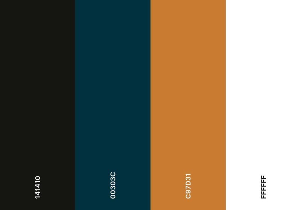
Of course, what’s most important is that your brand colors reflect who you are, what your business is, and (most importantly) your target clientele. Wapiti chose a clean look with 2 main dark colors, a nearly black color and a dark blue as well as a primary accent color that is our gold color (shown below).
We recommend choosing anywhere from 3 to 5 colors for your style guide with the first 3 colors being your “Primary colors.” Wapiti has 3 primary colors and we also use white and a light grey pretty heavily. For reference, here are our four brand colors taken directly from our style guide:
On top of these colors, we also will use slightly lighter or darker versions for accents and hover effects throughout our website. Once you’ve established your colors, you have the basic building blocks of the next steps of this guide.
Step 2: Your Logo
It’s important to have a crisp, clean version of your logo that can be used in your style guide as well as in all forms of print and internet marketing. You should keep a vector formatted version of your logo at all times. Unlike images, vectors can be stretched and shrunk indefinitely without any quality loss. Nothing screams “run away!” more than a fuzzy or pixelated logo.

Which version of the Wapiti logo instills more trust?
The initial design of your logo will often be one or two colors in whatever color scheme the designer decides to use. I’d argue that all of these steps are a reason to hire a professional brand creation/marketing company *cough cough* ?. In either case, it’s important to ensure your logo matches your lightest brand color and your primary dark color.
Once you have a vector version of your logo in hand, next you need to create versions for various use.
- We like to keep an original vector from our editing program, Affinity Designer. That way we can always create more in any size or file format necessary.
- .eps – This is typically exactly the same as the original vector but is more universal and works in Serif’s Affinity programs, Adobe’s programs, and others. This is a great file for sending to professional printers.
- .png at 2000px and 500px width – This is great in quick grab situations.
- .jpg at 2000px – The image above was created as a .jpg and comes in handy from time to time (such as this post).
So at this point, if you’re following this article exactly as I’m laying it out, you should have 2 versions of your logo with a minimum of 5 file types per logo. Now – it’s time to create an alternative of your logo that will be used for other purposes like website icons, accents on marketing pieces, etc. Wapiti’s logo is built with two parts: the wapiti head and our company name. This makes the Wapiti mark on our logo the perfect icon. If you’re reading this post and your browser supports favicons, just look at the tab at the top for one example of how we use that alternate logo.
Step 3: Typography
While typography has always been a key element in design and marketing, it wasn’t until around 2010 that it started becoming an integral part of proper design. Now, if you visit a website with poor typography, you may not even realize why, but you start to discount the professionalism and validity of the company altogether.
Oh, and before I forget to say it… your logo design (if it has lettering) is a crucial part of your typography as well. Whether you have a custom font for the logo or it uses a mainstream font – it is crucial that the logo is compatible with the text on your site. With that said, you should have your logo open on your screen as you start the font hunt. There are many great resources online but I find this guide from Canva exceptionally fun and useful. It’s not just a tutorial (although it does help you understand font selection a bit) but it shows some great font selections that can help inspire your decision making. I will often open this (and other resources) when I work on branding and style guide creation for clients. It is a great inspiration and guide.
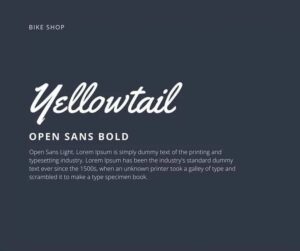
Now for each business, there is a different need and each person has a different desire for the look of what they create. Wapiti tries to err on the side of minimalism and clean layout. Of course, if you opened the link above to the Canva guide, you’ll see that they recommend having two fonts as well but used them in a different way. This is a pretty standard way to choose your font selection – and can have amazingly cool-looking results. I added a font example from Canva to show how two completely different fonts can look amazing together. Yellowtail has a distinct audience and if you’re in that audience, you’ll love that combination. Open Sans is now a pretty standard font on the web and is a great sans-serif font to use in design.
Wrapping It Up:
These are only 3 elements of branding but if you practice all of them and keep disciplined in your marketing to stick to that decision, you’ll be amazed at how much it upgrades everything you do. Your clients will always know when that email, flyer, or web page is one of yours and it will eventually start to show in repeat business as you earn their trust.
Just look around https://wapiti.digital. While the style may or may not be to your taste, you can’t deny that we have a pretty uniform approach to each and every page on our site.
Oh, sign up for our email marketing. You can see how our emails fit as well.

