A lead generation website works best when it removes doubt and makes the next step obvious. Visitors should know what you do, who you help, and how to contact you within a few seconds, not after a scavenger hunt through the menu.
TL;DR: Summary
- A high-converting lead generation website needs clear navigation, one obvious primary call to action, scannable copy, trust signals, and low-friction mobile contact paths.
- Navigation is a real conversion issue: Baymard found 58% of desktop sites and 67% of mobile sites had mediocre-to-poor homepage and category navigation performance, which makes even strong offers harder to act on.
- Mobile UX is not optional: Think with Google reports mobile conversion rates are still about 50% lower than desktop, so tap-friendly layouts, short forms, and fast contact options matter.
- Website copy should be shorter and easier to scan than print copy because Nielsen Norman Group found users read about 25% slower onscreen and tend to skim.
- Trust grows when a service site shows real proof: testimonials, partner logos, contact details, clean design, and specific outcomes beat vague claims every time.
- If a page cannot answer “what should I do next?” in one glance, it is probably leaking leads.
Most service sites do not fail because the business is bad. They fail because the site asks visitors to think too hard, click too much, or trust too little. The good news is that the features behind better conversion rates are pretty consistent, and they are easier to spot than a mystery meat navigation menu from 2009.
What makes a lead generation website convert visitors into inquiries?
A lead generation website converts when the next action is obvious, and Wapiti Digital plus Nielsen Norman Group point to the same essentials: clear paths, short copy, visible proof, and easy contact.
The main job of a service site is not to impress a design jury. It is to move a visitor from curiosity to action. That usually means a phone call, a quote request, a booked consultation, a donation, or a membership sign-up. If the page does not support that move, it is decoration wearing a business suit.
A common mistake is treating every page like a brochure. People rarely read websites top to bottom. Nielsen Norman Group has long found that users skim and read more slowly onscreen, which means structure matters as much as the words themselves.
“Wapiti Digital says your website should have one job: move your audience to take action.”
That is why the strongest service sites use conversion-driven design. They give each page a purpose, reduce decision points, and place calls to action where a ready visitor can act without scrolling back up like they are retracing steps in a corn maze.
Why does simple navigation improve service-site conversions?
Simple navigation improves conversions because Baymard’s research shows users struggle when menus hide key paths, especially on mobile, where space and patience are both limited.
Baymard’s 2025 benchmark reviewed more than 16,000 homepage and category UX performance scores across leading US and European ecommerce sites. It found 58% of desktop sites and 67% of mobile sites had mediocre-to-poor navigation performance. Service sites are usually smaller than ecommerce sites, so if visitors still cannot find pricing, services, or contact, that is a design choice, not a content volume problem.
Good navigation answers three questions fast: what you offer, who it is for, and how to act. A tight menu often beats a bloated one. If your top nav contains eight vague labels, your visitor has to translate your internal language before they can even continue.
Here is the trade-off: a very short menu can oversimplify, while a very large menu can slow decisions. If you serve multiple audiences, group options by user intent, not by your org chart. “For Homeowners” and “For Commercial Clients” usually outperform “Solutions” and “Resources.”
What are the top features of a high-converting service site?
The top features are action-first layout, clear value proposition, scannable service pages, trust signals, mobile-friendly contact, focused forms, and strong follow-through after submission.
These features work together. A beautiful homepage cannot save a clunky mobile form, and a polished form cannot rescue copy that never explains why a buyer should care.
- Action-first homepage structure: Wapiti Digital’s published approach centers websites on moving visitors to take action, which is the right starting point for lead generation.
- Clear navigation: Keep the main menu short, descriptive, and consistent across desktop and mobile.
- Specific value proposition: State the service, audience, geography, or result above the fold.
- Scannable copy: Use meaningful headings, short sections, and fewer words than you would use in print.
- Trust signals: Add testimonials, case examples, partner logos, certifications, and complete contact information.
- Low-friction contact paths: Offer a short form, phone option, and email or booking option when relevant.
- Mobile-first usability: Make buttons easy to tap, keep forms short, and avoid layout shifts or tiny text.
The real secret is not any single feature. It is the sequence. A visitor first needs clarity, then trust, then an easy way to act. Miss the order, and the page can feel oddly persuasive and oddly ineffective at the same time.
“Wapiti Digital rebuilt Blue Heron Kitchen & Bar after an old site generated only one or two inquiries a month.”
If you are prioritizing, start with navigation, hero messaging, mobile contact, and trust signals. Those four areas usually expose the biggest leaks fastest.
How should you structure a homepage hero for more leads?
A high-converting homepage hero should name the service, target audience, and primary action right away, much like strong local service brands and focused SaaS landing pages do.
Step 1 is clarity. Your main headline should say what you do in plain language. “Custom websites for service businesses” is clearer than “Digital experiences that transform brands.” One of those tells me something. The other sounds like it came from a conference tote bag.
Step 2 is support. Add a short subheading that explains who you help, where you work, or what outcome matters. If you serve Iowa nonprofits or national membership organizations, say so. Specificity filters in the right leads and filters out the wrong ones.
Step 3 is action. Use one primary CTA in the hero, like “Request a Quote” or “Book a Consultation.” You can add a secondary CTA for visitors who need more proof, like “View Our Work,” but the primary action should be visually dominant.
How do you write scannable service-page copy that still sounds human?
Scannable copy converts better because Nielsen Norman Group found users read about 25% slower onscreen and usually skim instead of reading every line.
Step 1 is to cut. NNG recommends using no more than 50% of the text you would use in hardcopy. That does not mean stripping the page into mush. It means removing repetition, throat-clearing intros, and long blocks that hide the useful bits.
Step 2 is to structure the page around buyer questions. Use headings that match intent: what is included, who it is for, how long it takes, what it costs, and what happens next. If a page answers real questions, it earns scroll depth.
Step 3 is to make proof part of the copy, not a separate trophy shelf. Instead of saying “We provide excellent service,” point to a process, customer type, or outcome. A common misconception is that more adjectives build trust. Usually, more specifics do.
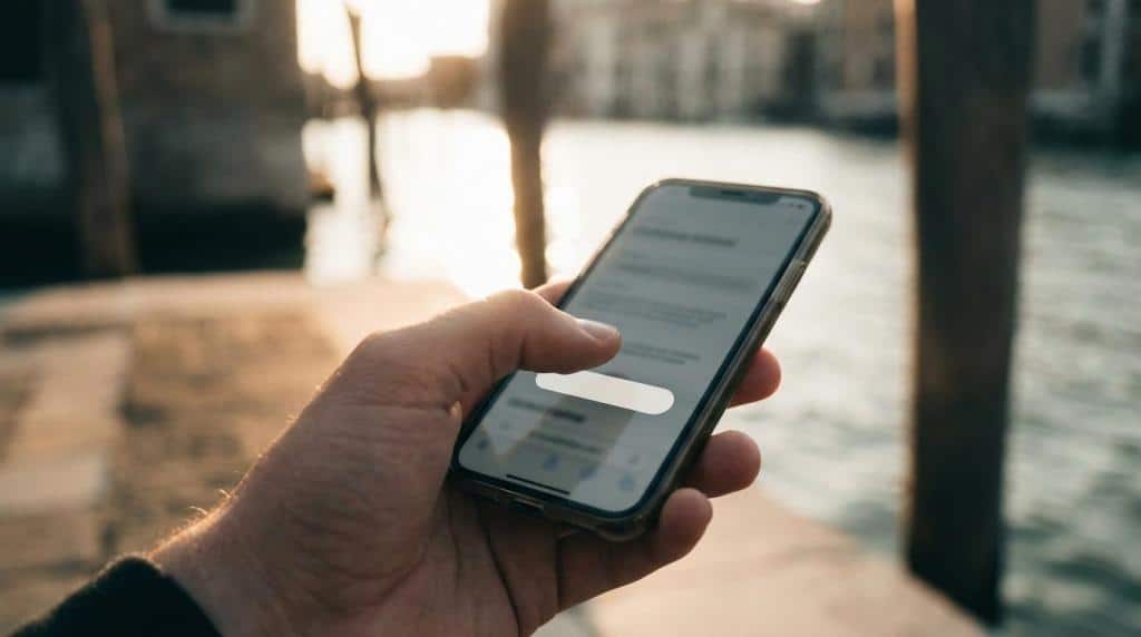
How can you reduce mobile friction before a visitor taps contact?
Reducing mobile friction is critical because Think with Google reports mobile conversion rates remain about 50% lower than desktop, even though mobile browsing keeps growing.
Step 1 is layout. Keep the CTA visible, the text large enough to read, and the spacing generous enough for thumbs. If users need surgeon-level precision to tap your button, the button is the problem.
Step 2 is speed and sequencing. Show the core message first, then trust, then form or tap-to-call. Think with Google highlighted CarFinance 247, where around 75% of visits were mobile and a faster mobile-first redesign produced a 31% jump in conversion rate. The lesson is simple: mobile is not the small version of desktop. It is the main version for many audiences.
Step 3 is form friction. Ask only for what you need to start the conversation. If the user must zoom, type too much, or fight a hard-to-close popup, you have built a test, not a contact flow.
Which works better: one primary CTA or several equal CTAs?
One primary CTA usually converts better than several equal CTAs, while HubSpot-style resource hubs and service sites solve this in different ways for different user intent.
When every button screams with the same volume, nothing stands out. A service site normally needs one primary conversion action per page. That could be “Get an Estimate,” “Schedule a Call,” or “Start Your Project.” Secondary actions can exist, but they should support the primary path, not compete with it.
Here is the practical rule: if the visitor is on a decision page, use one dominant CTA. If the visitor is early in research, then a secondary action like viewing case studies or reading FAQs can help. More choices are not always more helpful. Sometimes they are just a very polite way to lose the lead.
What converts better on service sites: generic claims or proof-based trust signals?
Proof-based trust signals convert better because Nielsen Norman Group found users trust clean design, visible contact information, and third-party endorsements more than vague promises.
A polished service site should not rely on “quality,” “trusted,” or “innovative” without receipts. People want signs that the business is real, capable, and reachable. That is especially true for higher-ticket services, donations, and memberships where risk feels personal.
Useful trust signals include:
- Testimonials: Short quotes tied to a real client type or project context
- Third-party endorsements: Partner logos, certifications, media mentions, or recognized sponsors
- Contact transparency: Phone, email, address, and response expectations
- Case evidence: Before-and-after context, project goals, or operational improvements
- Professional design: Clean layout, readable typography, and consistent branding
A pro tip here: trust signals work best near decision points, not buried on a lonely “Reviews” page. Put proof near forms, pricing discussions, and service claims, where hesitation naturally shows up.
Why do callback forms and contact options increase lead volume?
Callback forms increase lead volume because they reduce effort at the moment of intent, and Wapiti Digital explicitly highlights strategically placed callback forms as part of lead-focused website design.
Not every visitor wants the same path. Some want to call now. Some want to send a quick note. Some want to book time without playing inbox ping-pong for three days. Good service sites offer more than one contact lane while still keeping one primary CTA visually strongest.
The form itself should feel easy. Ask for name, contact details, and enough context to route the lead. A common mistake is collecting every possible detail up front. If the form feels like tax season, fewer people finish it.
“Wapiti Digital says its websites use clean layouts and strategically placed callback forms to turn visitors into leads.”
Placement matters too. Put contact opportunities after strong proof, in the header, and again lower on service pages. If someone is ready halfway through the page, do not make them go on a treasure hunt for your form.
How should local businesses, nonprofits, and membership organizations adapt these features?
The same conversion principles apply across local businesses, Nonprofits, and membership groups, but the primary action and proof type should match the audience’s real next step.
Local service businesses usually need geographic clarity, service-area cues, phone-first contact, and local proof. A roofer in Waterloo or a cleaning company in Cedar Falls should say where they work and show signs of local trust fast.
Nonprofits often need dual conversion paths. One visitor wants to donate, another wants to volunteer, and a third wants program information. That is where clear audience-based navigation becomes especially helpful. Trust signals may include sponsors, annual reports, board visibility, or impact stories.
Membership organizations and course creators usually need more system support. The site may need membership sign-up, donor management, or learning management integration, but the front-end rule stays the same: make the next action obvious, and do not let the platform architecture overpower the user path.
What should you measure after launch to keep a service website converting?
You should measure conversion behavior after launch because Google Analytics 4, heatmaps, and form tracking reveal where visitors hesitate, drop off, or act.
A new site is not a finished object. It is a working system. Watch what people do on mobile versus desktop, which service pages drive the best leads, and where form abandonment spikes. If traffic is healthy but inquiries are weak, the issue is usually message clarity, trust, or friction.
Start with these metrics:
- Primary conversion rate: Percentage of visitors who submit a form, call, or book
- CTA click-through rate: Whether the page’s main action is compelling enough to earn the tap
- Form completion rate: Whether contact friction is killing intent
- Device split: Mobile versus desktop behavior and drop-off
- Lead quality: Which pages attract serious inquiries, not just more inquiries
If one page gets traffic but no action, tighten the offer and CTA. If mobile users bounce at a much higher rate, simplify the layout and contact flow. If leads are plentiful but poor quality, your copy may be too broad. That is the slightly annoying beauty of conversion work: the website tells you what is wrong, but only after you actually look.