Most businesses lag a couple years behind the latest marketing design trends with only the fast moving, most agile brands keeping a consistently fresh look. It does seem that, with every year however, there is an updated style your marketing might want to adapt to. While the largest determinant of design is your brand, it’s important to stay up with modern trends. This post is meant to guide the reader a little more on what beautiful design entails, especially for 2019.
Clean, Minimalist Design Without Borders & Bars
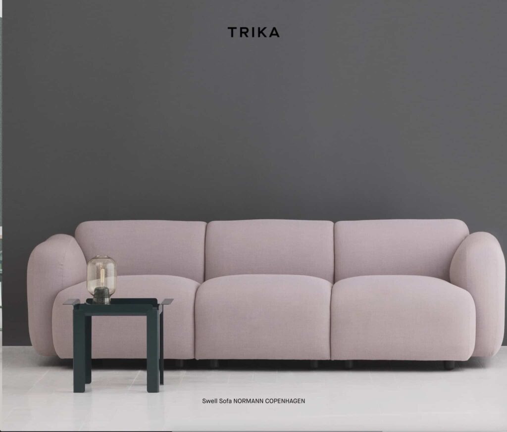
It wasn’t that long ago that building websites, creating digital marketing, or even working with print required you to separate your design elements using boxes and borders. In fact, I’m currently in a rebuild of a site that was built using hard, colorful lines and boxes. It’s being completely rebuilt and rethought from the ground up with minimalism being the key. In fact, minimalism is the current trend and likely will be for some time.
From a marketing design trend perspective, minimalism – at least when it comes to wording – has always been key. The more you can say with the least amount of actual words used, the better. A slogan that says “Taste The Rainbow” (Skittles) or “Finger Lickin’ Good (KFC) is meant to paint an image in your head using just 3 words each. Wapiti simplified our slogan to just two words, Creatively Smart. The common thread in all of these slogans is that paragraphs of information are implied by using less than a handful of actual words.
Finally, it seems marketing design trends for graphic design is fully moving this direction. In fairness, many businesses (ourselves included) have long started moving into a more minimal design aesthetic, but there are still many businesses who convey a really busy, confusing message to their clientele. For 2019, expect massive movement towards minimalism in design. (Yay, I’m so excited about this!)
Flat Design With A Stand Out Element
Seemingly driven by mobile phone OS developers (I’m looking at you, Apple, Microsoft & Google), flat design has become all the rage for most designers. As much as I poke fun at the “big boys” for steering the industry toward a particular aesthetic, I feel this is a really good trend and fits into the overall minimalist look that follows the current design movement.
What’s happened with a lot of flat design however, is that there are color bars and squares all over a lot of the marketing out there. Sometimes this can be a good thing… often it is not. Some marketing has bucked this trend all together and stuck with rounded elements reminiscent of the early 90’s web design or, even worse, have gone the skeumorphic route of making every design look like an actual item. Generally this is a super bad experience for the person looking at your designed marketing piece.
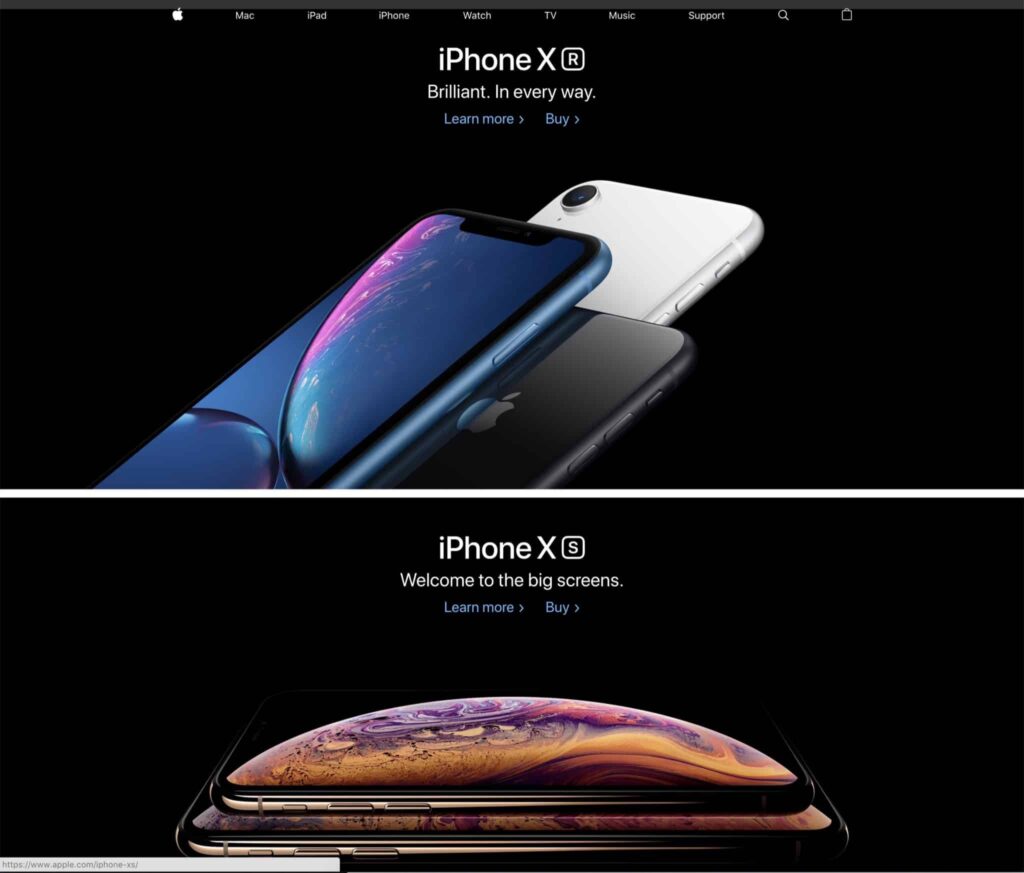
In 2019 we’re going to see, en masse, a new trend that I’m pretty excited about. That trend marries flat design with 3D elements. This is much different than skeumorphism in that it takes a realistic item and drops it into the overall design of the page. Apple currently is one of the kings of this kind of layout. In my personal opinion, I also think they are one of the driving forces behind this look. If done right, it can look downright gorgeous!
Clean, Moving Elements & Text (Digital Only)
I often encounter one of two scenarios in digital design:
- The online design element is completely static and honestly, boring. Think Google or Amazon. Also, note that boring isn’t necessarily a horrible thing if it allows you to highlight your products. Even Amazon has been bringing in more flowing elements as of late, however.
- The site is moving around and you can almost get dizzy looking at it. While I absolutely love Magic Leap’s interactive website, it only works for their product type. Most businesses would wow customers with this design and sell nothing because the site is so much fun and totally impractical to use.
The newest marketing design trends for digital are moving towards motion and fluidity within an otherwise static layout. For example, BrandShouter.com has tons of minor movements throughout added in a tasteful way. When you load a page outside of our articles section (that’s where you are now), you’ll see little movements such as text quickly but gently fading into view and buttons moving up from the bottom of the screen to let you know they are there.
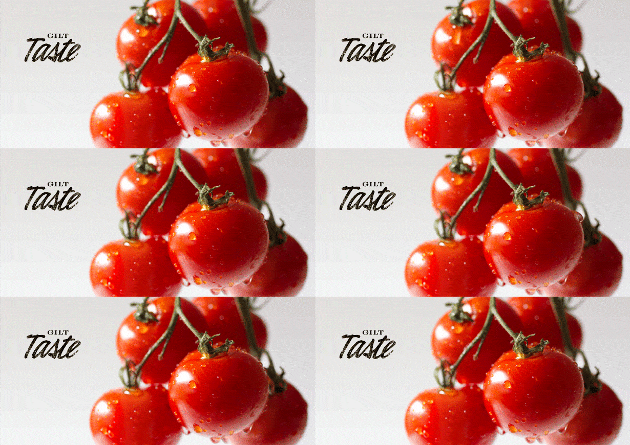
The important part of these marketing design trends is to understand that movement is good but too much movement is incredibly bad. Finding the balance is what brings elegance to your website or any other digital marketing you may do. The advertisement below is an amazing example of this.
Bright Colors Set Against Neutral Colors
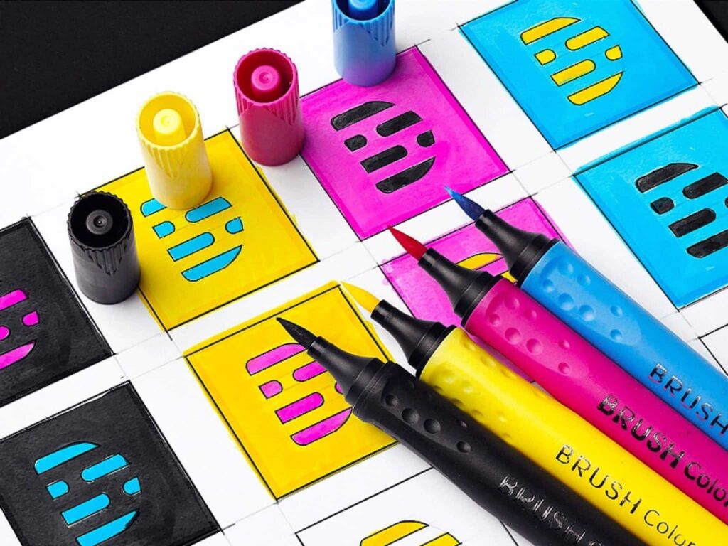
Colors are fun, right? I have to admit, when it comes to my taste for design, I typically move towards whites, blacks, light tans and grays to anchor the look of my creation. Those colors suit my taste for minimalism. There is, however, a whole world of design beauty that even I have to admit is pretty awesome.
Using beautiful colors matched strategically to the matching brand, a lot of modern design is currently bucking the idea that minimalism requires boring base colors. Instead, a darker but vivid fuchsia with white, bold text can look really amazing. A vivid yellow with a touch of a grainy pattern can look amazing with bold black text. Some colors seem to support black and white text and looks great with both. Even still, some designers are marrying multiple compatible colors together to create something extraordinary.
Beautiful, Complimentary Typography
Much as it has been a major design element for 2017 and 2018, typography remains the single largest way to set your look apart from the competition. Finding no more than 2 complimentary fonts will create a lasting brand experience whether it be on your website or on your business card. Your typography remains the single best way to remain consistent with your branding.
I had a discussion with another designer about a year ago when it came to the idea of font selection. We agreed that the brand we were collaborating on should be limited to 2 fonts in all text marketing. We disagreed, however, on the font for the logo. He thought that the logo should contain its own font separate from all other printing. I took the standpoint that it should share the font with the rest of the site to increase brand consistency. I went online to find articles to prove my point and realized that this is a raging debate with designers.
Ultimately, regardless of where you stand on this, it’s important to simplify the fonts throughout. Wapiti only uses 2 fonts on everything we do. Go ahead, look it up and try to prove otherwise. I’m waiting. ?Many other much bigger brands than ours apply the same principle with their marketing as well.
Conclusion on Marketing Design Trends
While this is by no means an exhaustive list, you should be able to get the idea of where marketing design trends are moving for 2019 and potentially into 2020. Clean, minimalism while still carrying a beautiful design aesthetic is king right now – and for good reason. Have you ever tried to buy from a site that wasn’t set up this way? I’m willing to bet you didn’t end up purchasing anything… or at the very least, hated the entire experience.
Does your site look great but you’re still not getting eyes? Check out our podcast/article on SEO Basics for WordPress.
